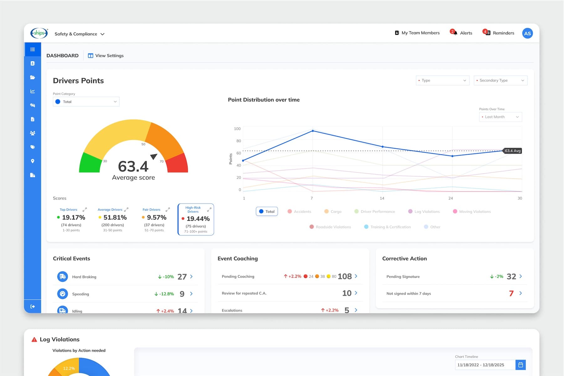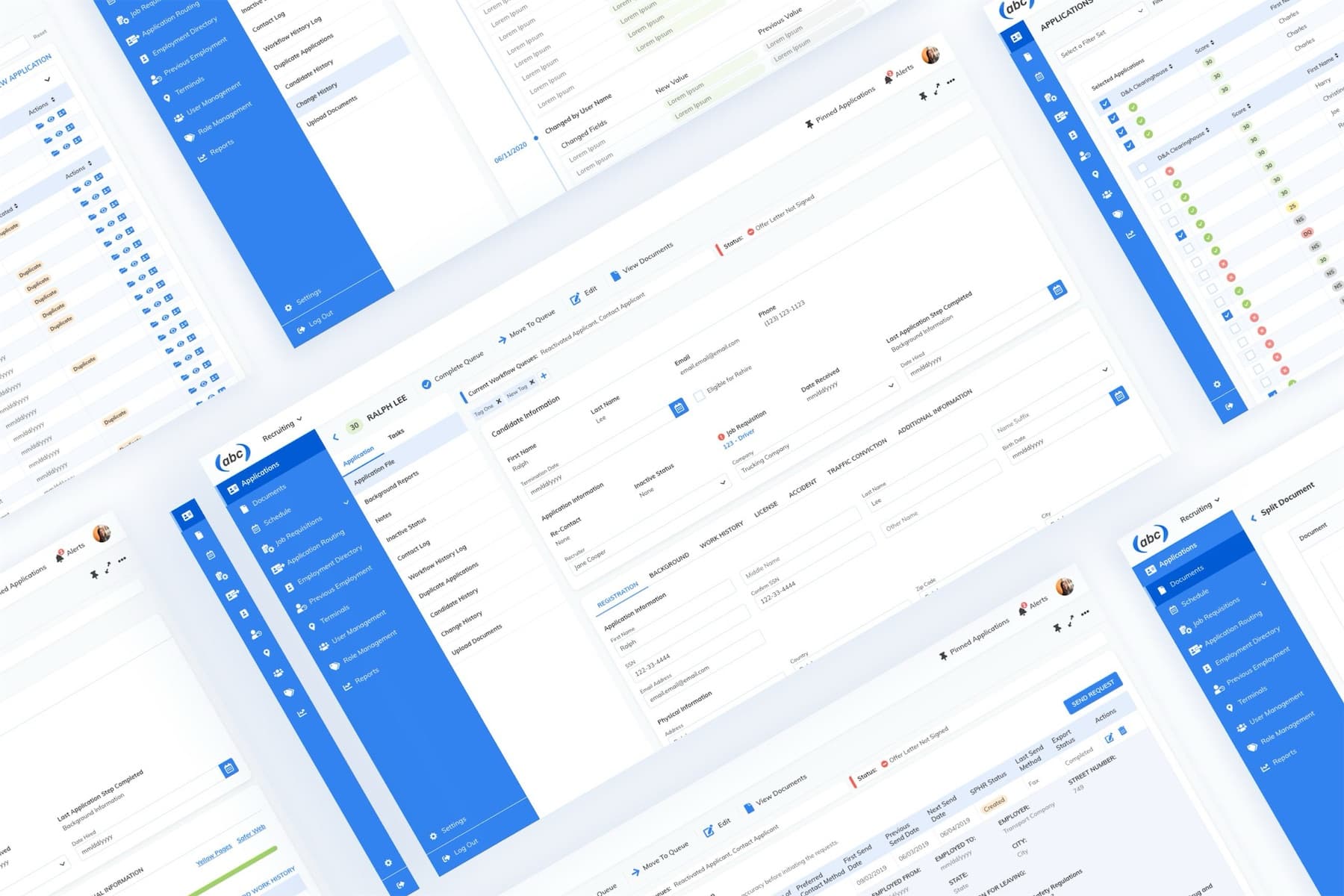
A recruiting platform that grew one feature at a time
EBE's recruiting platform runs both sides of driver hiring: the branded job portals where drivers apply and the internal tools recruiters use to review, contact and hire them. Good drivers are in high demand, so every applicant counts. As the product grew feature by feature, its screens drifted apart, and on a phone, where most drivers apply, it showed.
- Screens had drifted apart in style and behavior
- Some applicant pages stretched on and on, with the mobile job listing over 19,000 pixels tall
- Radio buttons were too small to tap comfortably
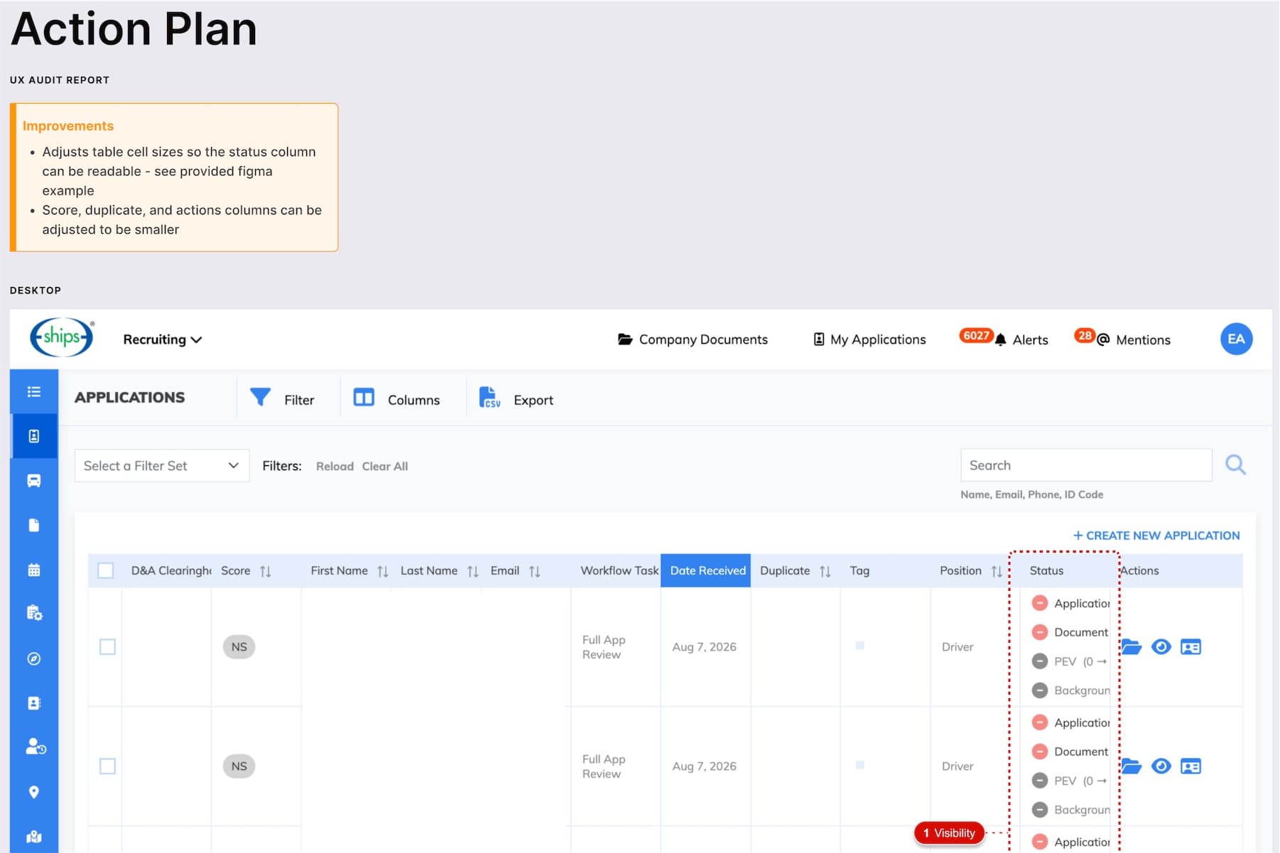
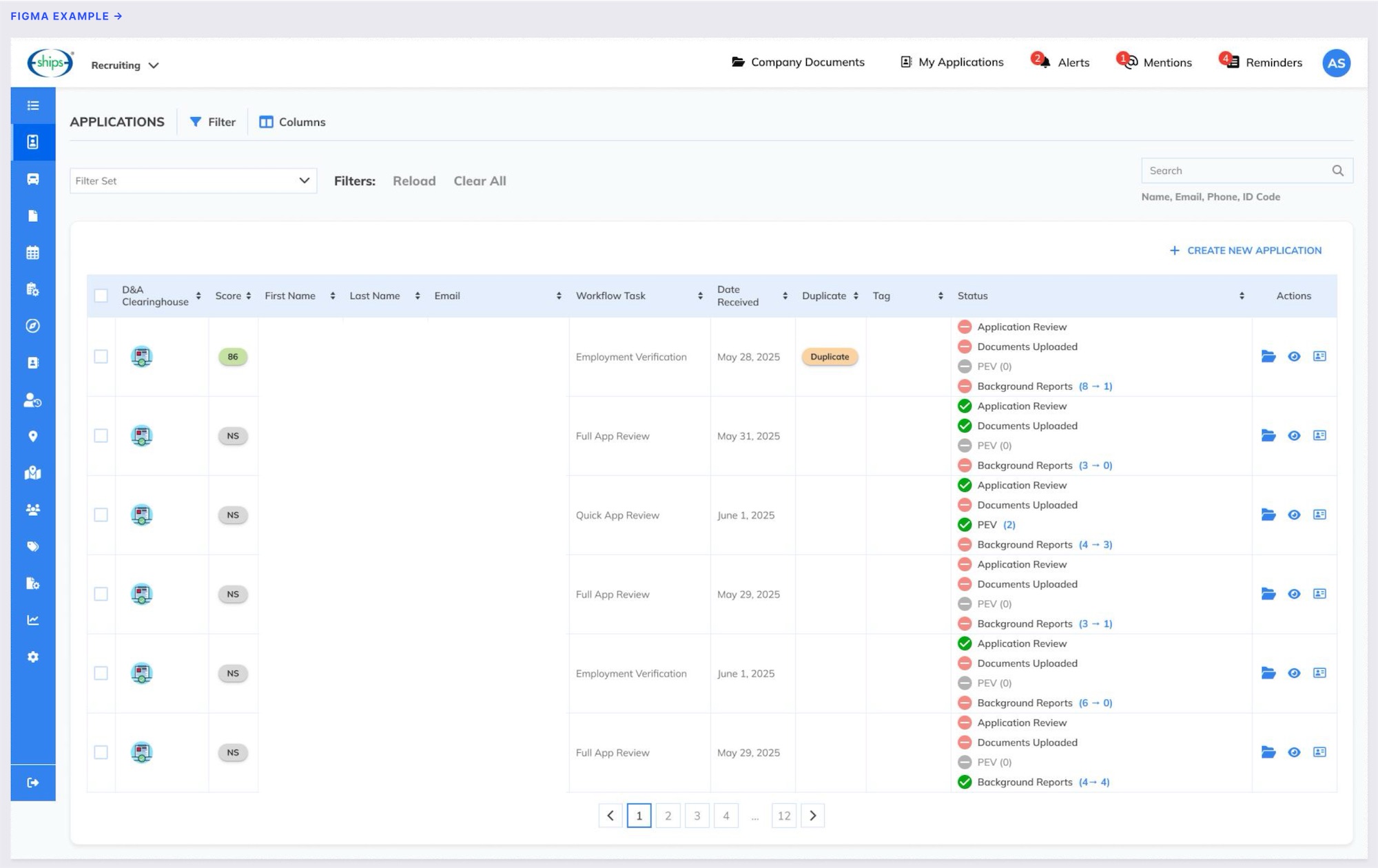
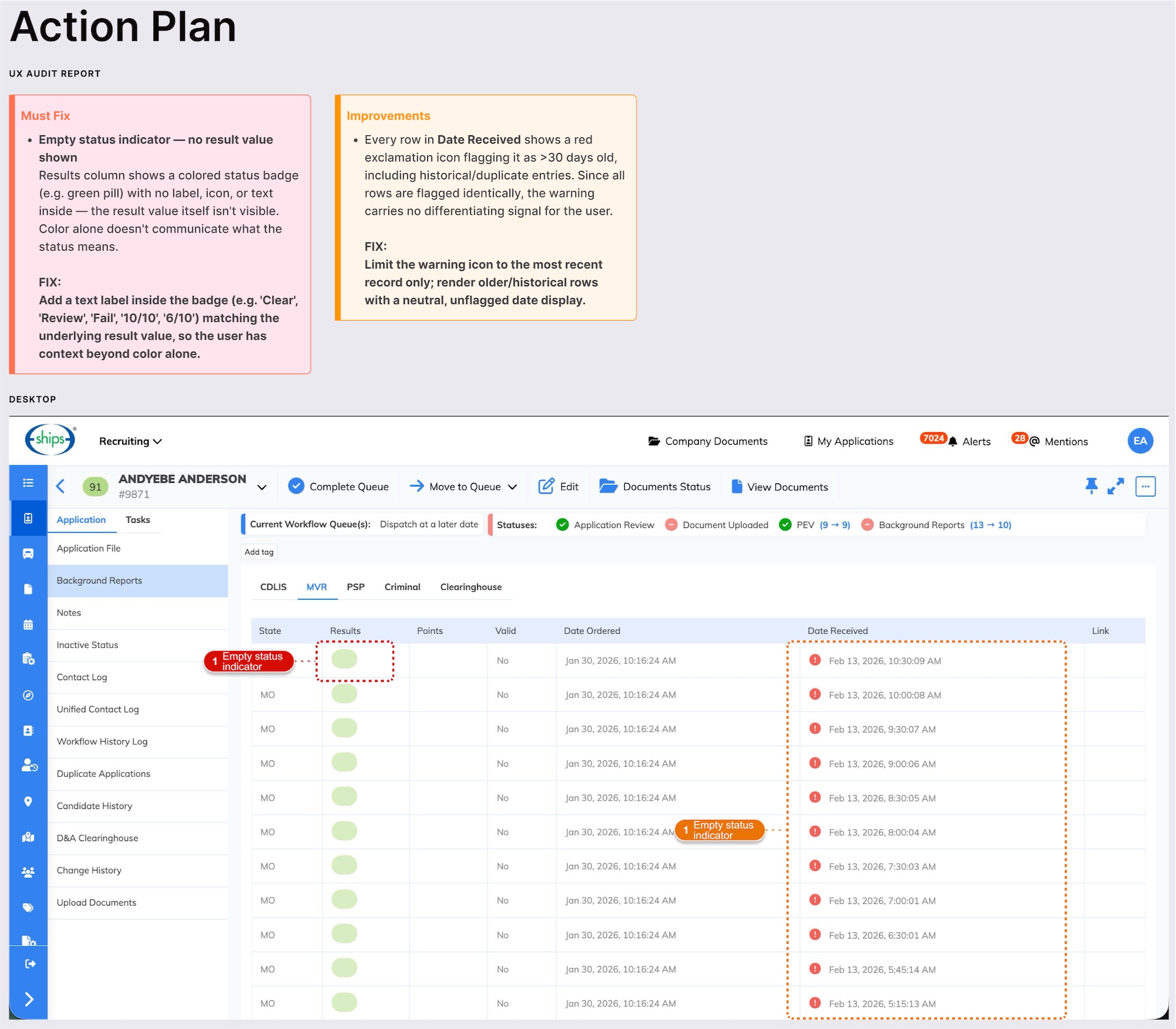
- Dense recruiter tables made key details like application status hard to scan
A structured audit, applicants first
Symmetria partnered with EBE to audit the platform module by module, starting with the only screens that external, first-time users ever see: the applicant flow, from job search to document upload. The internal recruiting screens came next. The redesign that came out of the audit is live in production.
Applicants first, on a phone
Every application step was reviewed on a phone-sized screen, the way a driver would go through it. Then the audit moved to the recruiter side: applicant overview and search, the application file and its tabs, recruiting queues, plus offer and hire flows.
Four lenses, one format for every finding
Every screen was checked for visual consistency, accessibility basics, responsive behavior and wording. Each finding was logged the same way: screen, marked screenshot, issue, severity and proposed fix.
Design examples for the harder fixes
Where a fix was more complex, the audit included a design example showing exactly how the screen looks once it's applied. Developers could see the end result instead of interpreting a description.
Fixed once, in the components
Redesigned screens were built in Figma from the shared component library: Dropdown, Text Input, Calendar, Button and Checkbox. A new Yes/No toggle replaced the old radio pattern. Most recurring issues were fixed at the component level, so each fix carries across the whole product.
What We Delivered
- UI audit of applicant-facing and internal recruiting screens
- Marked screenshot, severity and proposed fix for every finding
- Redesigned screens in Figma, built from the shared component library
- New Yes/No toggle replacing the old radio pattern
- Mobile scroll-length comparison for every applicant screen
- Style-guide additions for the design system
A Closer Look
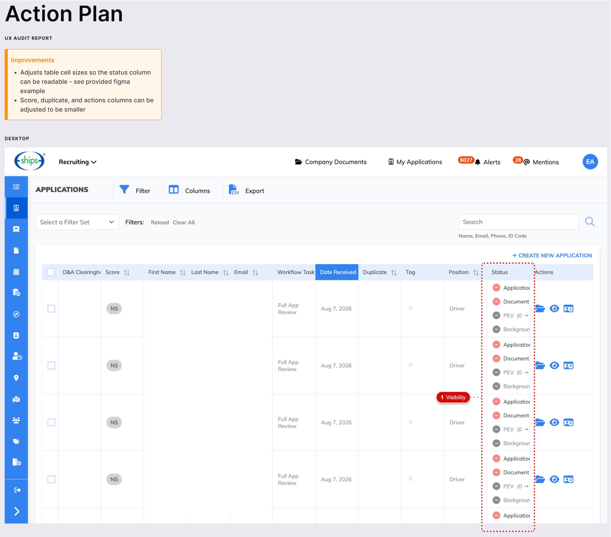 (opens full size in a new tab)
 (opens full size in a new tab)
 (opens full size in a new tab)
Mobile scroll length, screen by screen
Mobile scroll length of the redesigned applicant screens, compared with the originals. The biggest cuts came on the longest screens, and nothing applicants need to see was removed.
- Job Listing-90%
- Summary-91%
- Affirmative Action Program Information-83%
- Whole applicant flowAbout 2/3 less
- About 2/3
- Less mobile scrolling across the applicant flow
- Same Information
- Nothing applicants need to see was removed
- Component Level
- Where most recurring issues were fixed, so fixes carry across the product
- Live
- Redesigned screens running in production