Too much information and too many steps, in hiring that can't wait
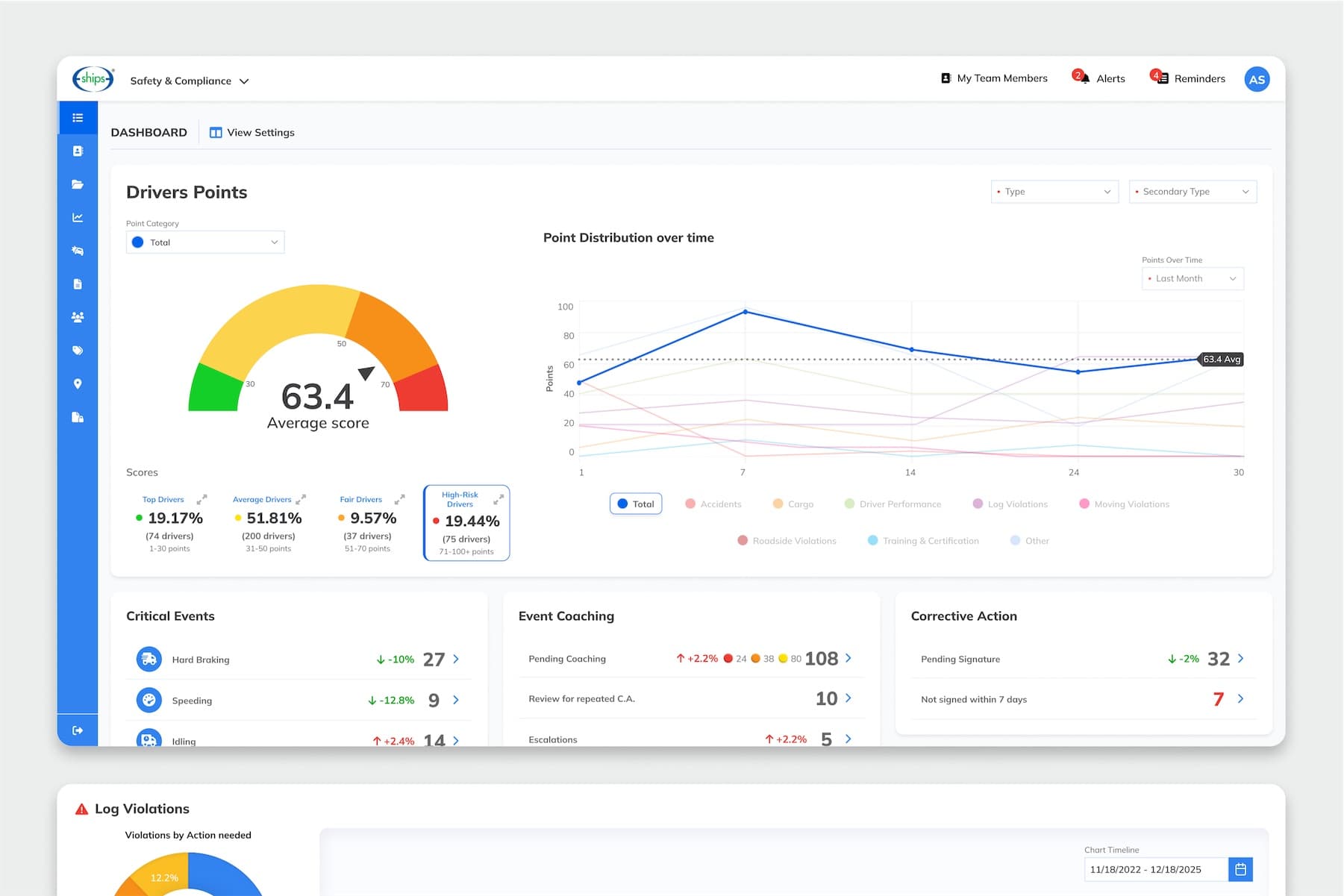
EBE's recruiting solution takes transportation companies through the whole driver hiring process: managing applications and open positions, screening candidates, scheduling interviews, completing forms and preparing driver records for the next stage. Hiring qualified drivers is competitive and time-sensitive, and EBE wanted existing recruiting teams to get more done. Yet recruiters were working on information-heavy screens where the next action was easy to miss.
- Information-heavy screens for candidates at every stage of hiring
- Details, actions and progress that could easily get buried
- Complex workflows that made everyday tasks harder to navigate
- A growing feature set, from candidate communication to paperless forms and integrations, that needed one consistent structure
From workflow analysis to front-end support
Symmetria partnered with EBE on the UX/UI design of the recruiting experience: candidate and application management, applicant profiles, job requisitions, forms, search and filtering, reporting and navigation. The work started with the existing workflows and competitor products, then moved through information architecture, UX flows and wireframes to high-fidelity UI and interactive prototypes.
Hierarchy built around the next step
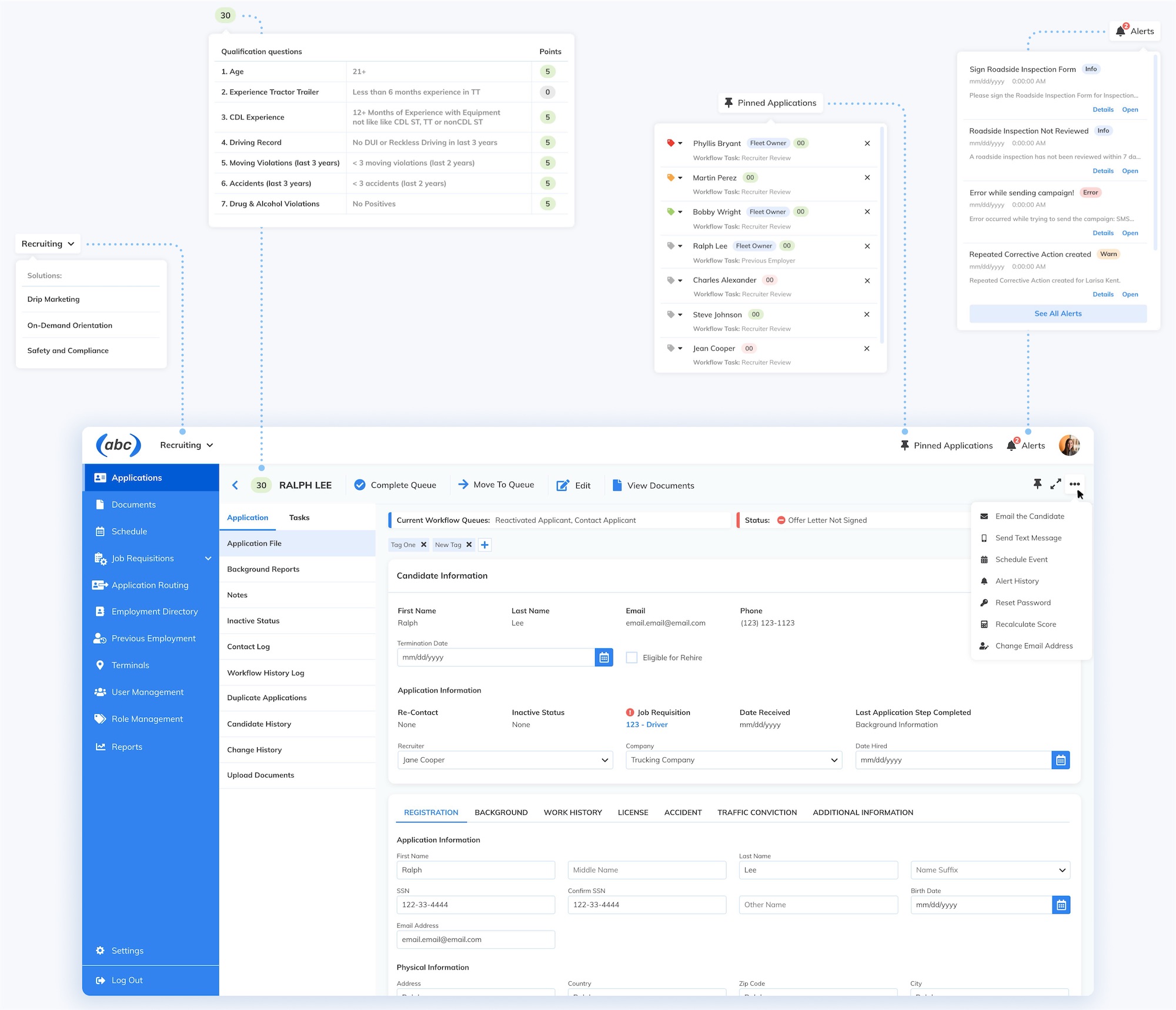
Screens are organized around three questions: where does this candidate stand, what needs attention and what happens next. Clear hierarchy keeps those answers from getting buried under the rest of the information.
Space for candidate data
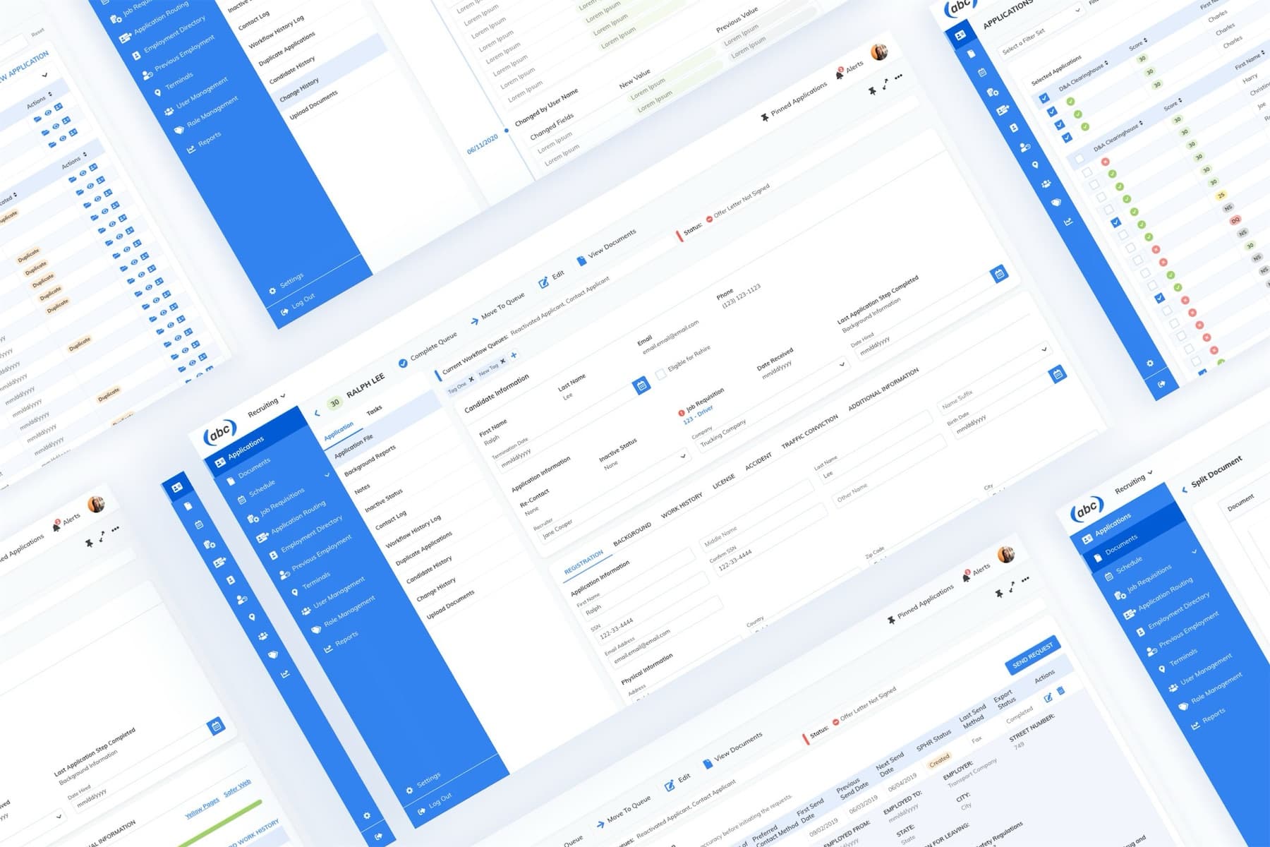
Recruiting screens carry a lot of information. The navigation folds away to hand that space back to candidate data, without putting the rest of the product out of reach.
One set of components and patterns
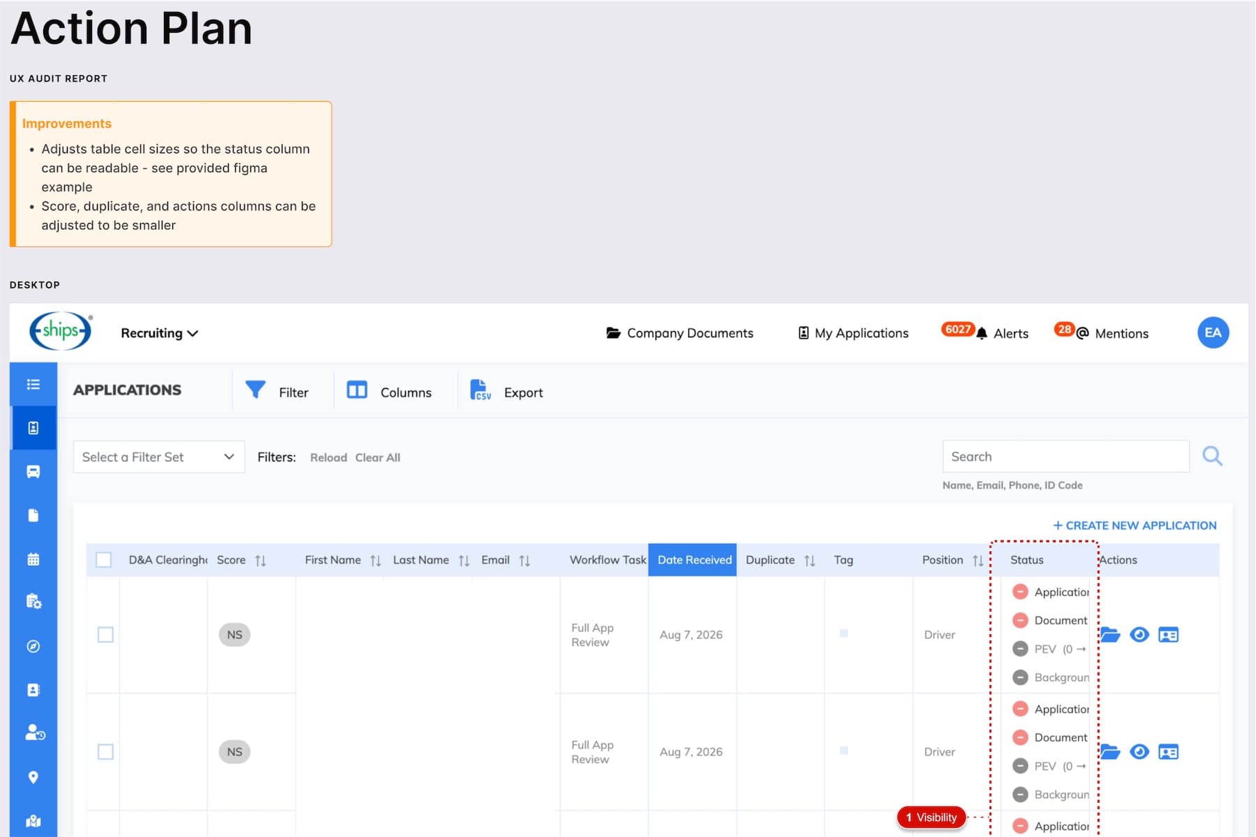
Applicant profiles, forms, job requisitions and search share the same reusable components and interaction patterns. A filter or a form field behaves the same wherever recruiters meet it, and new features have a consistent base to build on.
Design and development in the same loop
Designs were refined iteratively in close collaboration with EBE stakeholders and the development team. Symmetria also supported implementation with front-end and CSS work, carrying the design into the product.
What We Delivered
- Workflow and competitor analysis
- Information architecture and UX flows
- Wireframes and interface concepts
- High-fidelity UI and interactive prototypes
- Reusable components and interaction patterns
- Front-end and CSS support during implementation
A Closer Look
 (opens full size in a new tab)
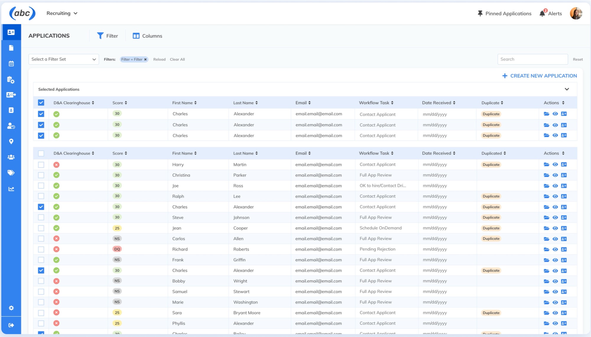 (opens full size in a new tab)
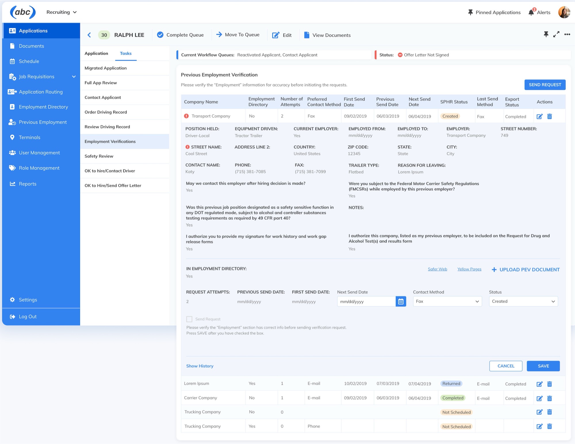 (opens full size in a new tab)
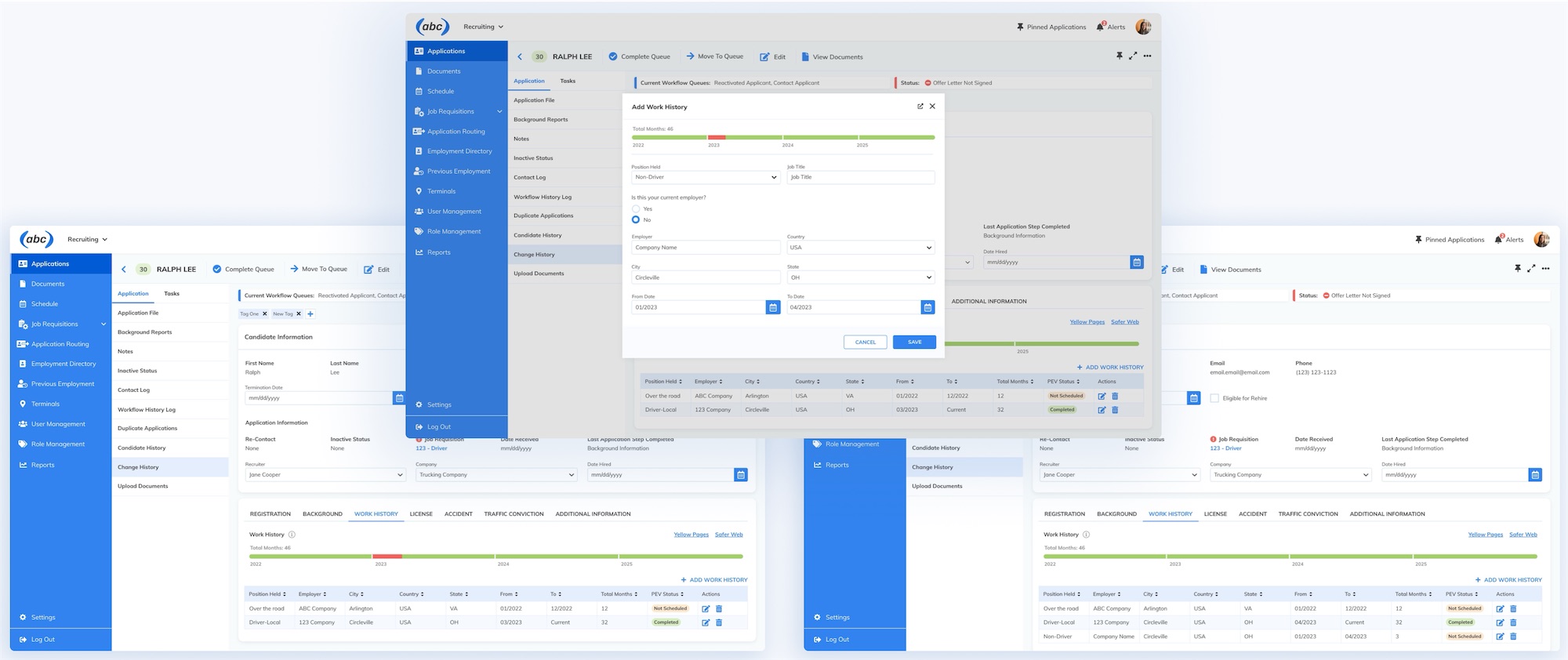 (opens full size in a new tab)
- Structured
- A consistent foundation the product kept growing on
- Easier
- Navigating candidate information and recruiting workflows
- Central
- Still at the core of EBE's recruiting offering today